
Notice
Recent Posts
Recent Comments
Link
| 일 | 월 | 화 | 수 | 목 | 금 | 토 |
|---|---|---|---|---|---|---|
| 1 | 2 | 3 | ||||
| 4 | 5 | 6 | 7 | 8 | 9 | 10 |
| 11 | 12 | 13 | 14 | 15 | 16 | 17 |
| 18 | 19 | 20 | 21 | 22 | 23 | 24 |
| 25 | 26 | 27 | 28 | 29 | 30 | 31 |
Tags
- 컴퓨터과학
- 상속
- 부스트코스
- 장고
- removetooltip
- 코딩독학
- 자바
- 노마드코더
- Django
- 건대입구맛집
- Python
- 알고리즘
- 추상클래스
- c언어문자열
- 남양주맛집
- BeautifulSoup
- python3
- 아스키코드
- 속초여행
- 정렬알고리즘
- 가상환경
- JavaScript
- 성수동카페
- pipenv
- FLUTTER
- 포인터
- 강원도속초맛집
- popupmenubutton
- richtext
- DOM
Archives
- Today
- Total
YUYANE
FLUTTER/ Drawer, Expanded, Responsive 본문
출처 github.com/abuanwar072/Flutter-Responsive-Admin-Panel-or-Dashboard
1. Drawer
- 모를 땐 네비게이션 메뉴를 하나하나 다 그렸는데 이렇게 간편한 위젯이 존재하다니!
- api.flutter.dev/flutter/material/Drawer-class.html
Scaffold(
key: context.read<MenuController>().scaffoldKey,
drawer: SideMenu(),
body: SafeArea(
child: Row(
crossAxisAlignment: CrossAxisAlignment.start,
children: [
// We want this side menu only for large screen
if (Responsive.isDesktop(context))
Expanded(
// default flex = 1
// and it takes 1/6 part of the screen
child: SideMenu(),
),
Expanded(
// It takes 5/6 part of the screen
flex: 5,
child: DashboardScreen(),
),
],
),
),
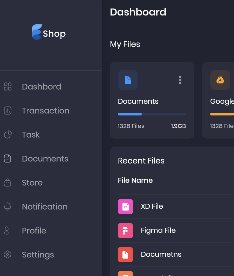
);class SideMenu extends StatelessWidget {
const SideMenu({
Key key,
}) : super(key: key);
@override
Widget build(BuildContext context) {
return Drawer(
child: SingleChildScrollView(
// it enables scrolling
child: Column(
children: [
DrawerHeader(
child: Image.asset("assets/images/logo.png"),
),
DrawerListTile(
title: "Dashbord",
svgSrc: "assets/icons/menu_dashbord.svg",
press: () {},
),
DrawerListTile(
title: "Transaction",
svgSrc: "assets/icons/menu_tran.svg",
press: () {},
),
DrawerListTile(
title: "Task",
svgSrc: "assets/icons/menu_task.svg",
press: () {},
),
DrawerListTile(
title: "Documents",
svgSrc: "assets/icons/menu_doc.svg",
press: () {},
),
DrawerListTile(
title: "Store",
svgSrc: "assets/icons/menu_store.svg",
press: () {},
),
DrawerListTile(
title: "Notification",
svgSrc: "assets/icons/menu_notification.svg",
press: () {},
),
DrawerListTile(
title: "Profile",
svgSrc: "assets/icons/menu_profile.svg",
press: () {},
),
DrawerListTile(
title: "Settings",
svgSrc: "assets/icons/menu_setting.svg",
press: () {},
),
],
),
),
);
}
}
2. @required
- @required 를 붙여줌으로써 필수 parameter를 빼먹지 않는 실수를 줄일 수 있다.
3. SafeArea
- 스크린이 사각형이 아니거나 스크린 위에 다른 요소(날짜, 배터리 표시 등)에 의해 화면이 가려지는 위험을 방지할 수 있는 위젯
- steemit.com/sct/@wonsama/191014-flutter-safearea
[flutter] 플러터 금주의 위젯 #01 safearea — Steemit
SAFEAREA (안전영역) 충분한 패딩(들여쓰기)으로 자식(child)을 삽입하는 위젯입니다. 예를 들어, 화면 상단의 상태표시줄, 노치, 카메라영역등이 존재하면 해당 영역을 포함하여 패딩처리를 수행…
steemit.com
4. Responsive Screen & Expanded
- 반응형 화면 그리는 데 유용한 코드
- 위젯 하나하나에 너비, 높이를 정해주기보다는 expanded를 적절히 활용하면 반응형으로 화면을 구현하기 수월하다.
- www.youtube.com/watch?v=_rnZaagadyo
class Responsive extends StatelessWidget {
  final Widget mobile;
  final Widget tablet;
  final Widget desktop;

  const Responsive({
    Key key,
    @required this.mobile,
    this.tablet,
    @required this.desktop,
  }) : super(key: key);

// This size work fine on my design, maybe you need some customization depends on your design

  // This isMobile, isTablet, isDesktop helep us later
  static bool isMobile(BuildContext context) =>
      MediaQuery.of(context).size.width < 850;

  static bool isTablet(BuildContext context) =>
      MediaQuery.of(context).size.width < 1100 &&
      MediaQuery.of(context).size.width >= 850;

  static bool isDesktop(BuildContext context) =>
      MediaQuery.of(context).size.width >= 1100;

  @override
  Widget build(BuildContext context) {
    final Size _size = MediaQuery.of(context).size;
    // If our width is more than 1100 then we consider it a desktop
    if (_size.width >= 1100) {
      return desktop;
    }
    // If width it less then 1100 and more then 850 we consider it as tablet
    else if (_size.width >= 850 && tablet != null) {
      return tablet;
    }
    // Or less then that we called it mobile
    else {
      return mobile;
    }
  }
}
@override
Widget build(BuildContext context) {
final Size _size = MediaQuery.of(context).size;
return Column(
children: [
Row(
mainAxisAlignment: MainAxisAlignment.spaceBetween,
children: [
Text(
"My Files",
style: Theme.of(context).textTheme.subtitle1,
),
ElevatedButton.icon(
style: TextButton.styleFrom(
padding: EdgeInsets.symmetric(
horizontal: defaultPadding * 1.5,
vertical:
defaultPadding / (Responsive.isMobile(context) ? 2 : 1),
),
),
onPressed: () {},
icon: Icon(Icons.add),
label: Text("Add New"),
),
],
),
SizedBox(height: defaultPadding),
Responsive(
mobile: FileInfoCardGridView(
crossAxisCount: _size.width < 650 ? 2 : 4,
childAspectRatio: _size.width < 650 ? 1.3 : 1,
),
tablet: FileInfoCardGridView(),
desktop: FileInfoCardGridView(
childAspectRatio: _size.width < 1400 ? 1.1 : 1.4,
),
),
],
);
}class ProfileCard extends StatelessWidget {
const ProfileCard({
Key key,
}) : super(key: key);
@override
Widget build(BuildContext context) {
return Container(
margin: EdgeInsets.only(left: defaultPadding),
padding: EdgeInsets.symmetric(
horizontal: defaultPadding,
vertical: defaultPadding / 2,
),
decoration: BoxDecoration(
color: secondaryColor,
borderRadius: const BorderRadius.all(Radius.circular(10)),
border: Border.all(color: Colors.white10),
),
child: Row(
children: [
Image.asset(
"assets/images/profile_pic.png",
height: 38,
),
if (!Responsive.isMobile(context))
Padding(
padding:
const EdgeInsets.symmetric(horizontal: defaultPadding / 2),
child: Text("Angelina Joli"),
),
Icon(Icons.keyboard_arrow_down),
],
),
);
}
}
5. 변화 가능성이 제로라면 const 를 적당히 활용하자.
'Framework > FLUTTER' 카테고리의 다른 글
| FLUTTER / Remove Tooltip of PopupMenuButton Widget (0) | 2021.06.19 |
|---|---|
| FLUTTER / Stack, RichText, Navigator (0) | 2021.05.05 |
'Framework/FLUTTER' Related Articles
more

Comments